Age Friendly Manitoba
Project Overview
The goal of this school project was to take an existing brand or organization connected to a social problem and develop a new persona and visual identity that communicates its purpose more effectively. Inspired by the challenges communities faced during the COVID-19 pandemic, I saw an opportunity to reimagine the Age-Friendly Manitoba program and strengthen its visual communication.
My goal was to redesign a brand identity that encourages connection, support, and understanding between different generations. I wanted to create a visual language that could make seniors and younger community members feel welcomed, supported, and connected, particularly during difficult and isolating times I had experienced. Ultimately, the project aims to communicate that an age-friendly community is not only about supporting older adults—it is about creating a healthier and more connected environment for everyone.
Age-Friendly Manitoba's Background
The Age-Friendly Cities project was originally developed by the World Health Organization (WHO) to promote healthy aging and encourage communities to become more supportive and inclusive of people of all ages. The initiative brought together cities around the world to explore how communities could better support healthy aging. Through conversations with seniors, caregivers, community organizations, and other stakeholders, the project identified eight key areas of community life that can contribute to creating more age-friendly environments.
Age-Friendly Manitoba applies this approach locally by creating opportunities for people to experience better health, participation, and security within their communities. An age-friendly approach benefits people of all ages by helping them live active and healthy lives in environments where they feel supported and included.As people age, it becomes increasingly important to remove physical, economic, and social barriers that can limit participation in community life. Age-friendly communities therefore aim to create better places to grow, live, work, play, and age.
Identifying The Challenge
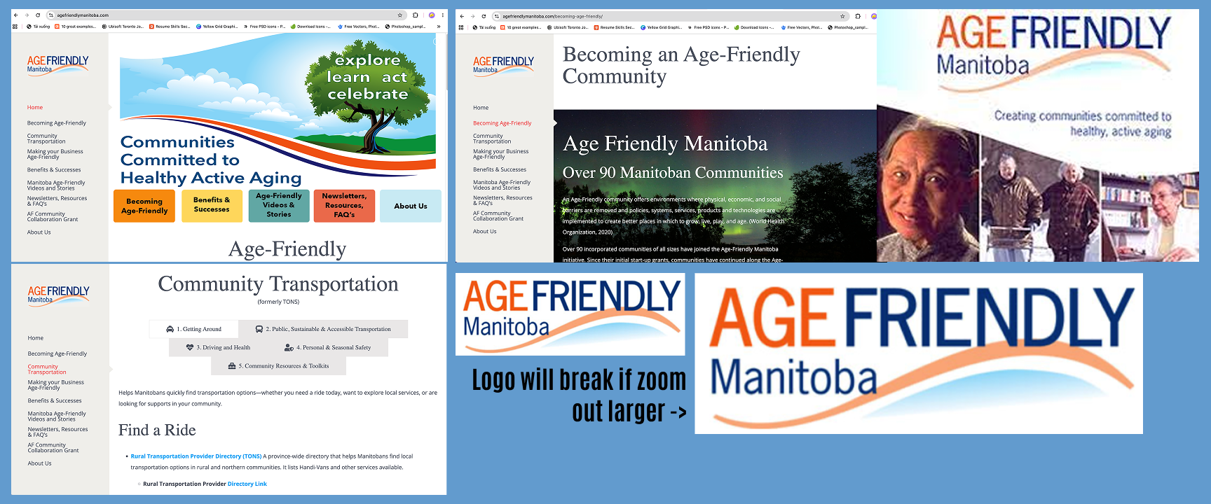
These was an opportunity for me to create a more recognizable, approachable, and engaging brand identity that could communicate the program’s values more effectively. Before developing the new visual identity, I examined the existing visual communication of Age-Friendly Manitoba and identified several areas that could be improved:
1. The existing logo is simple and clean, but lacks distinctive characteristics that make it memorable.
2. Some of the logos, photographs, and visual assets used throughout the website appear outdated or low-resolution.
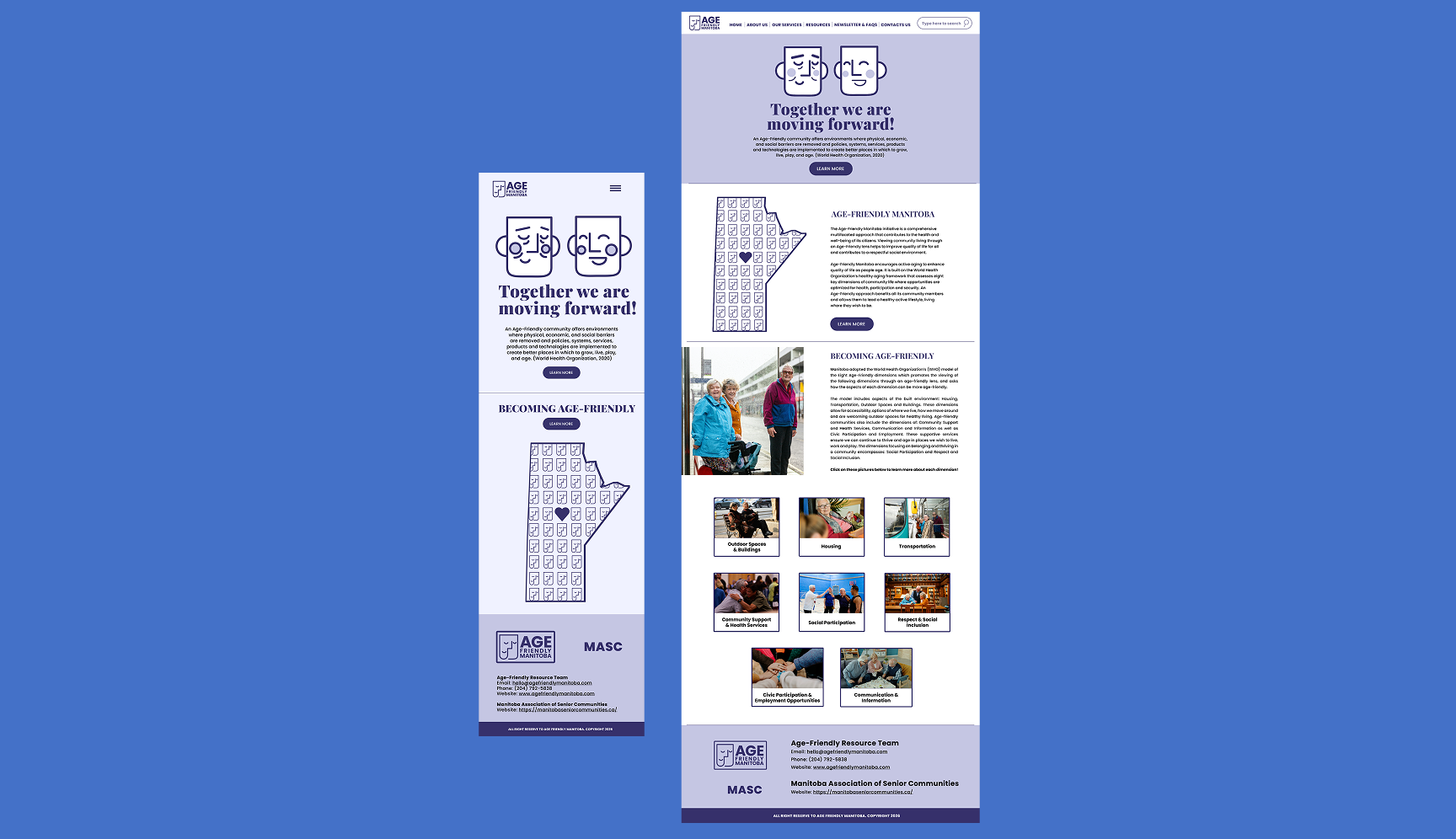
3. Website pages do not consistently follow a unified visual system, making the information feel overwhelming and difficult to navigate.
4. There is limited evidence of a clear campaign strategy for reaching and engaging the intended audience.
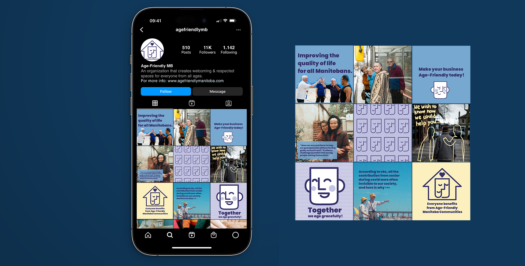
5. The program has limited social media presence through platforms such as Instagram and Facebook. Communication about the program and the support it provides is limited, contributing to a lack of public awareness.
Visual Development
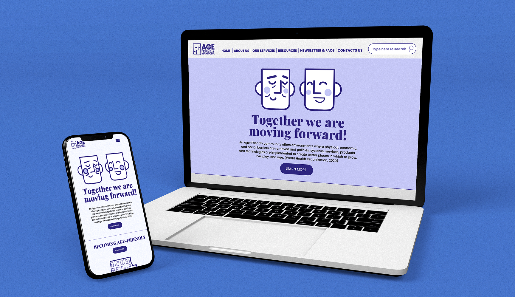
For the visual identity, I wanted the logo to communicate connection, calmness, trust, and openness. The central visual is a simplified human face paired with bold sans-serif typography. The facial form represents people and community, while the typography gives the identity a sense of strength and stability. The calm expression of the face, combined with a dark navy blue, creates a feeling of reliability and trust. The identity is supported by three primary colours—dark navy blue, light sky blue, and white—which create a visual system that feels both professional and approachable.
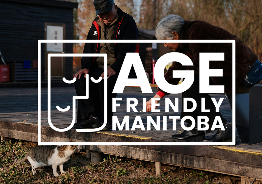
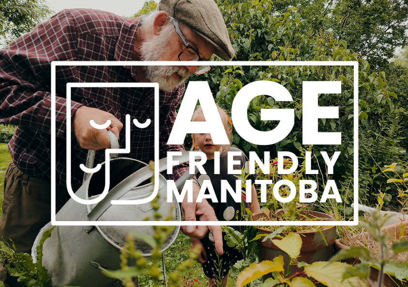
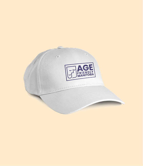
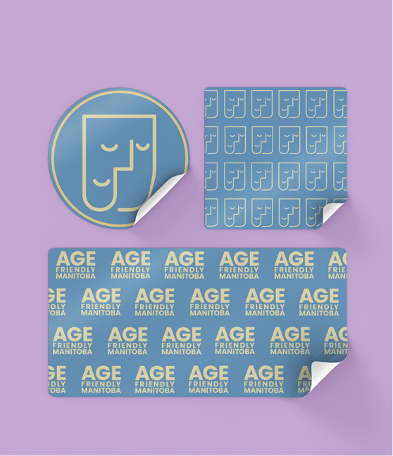
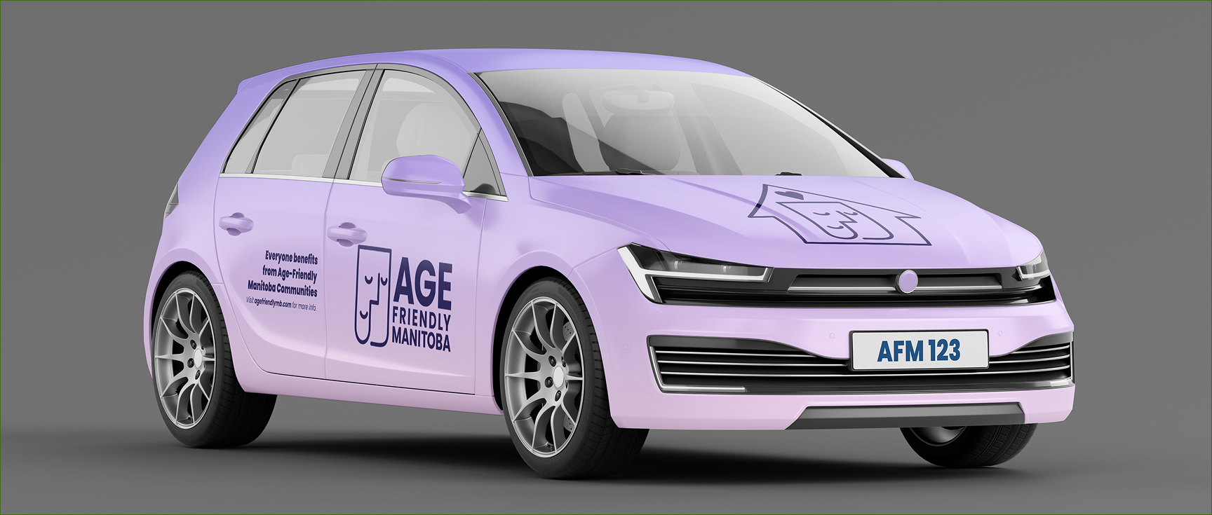
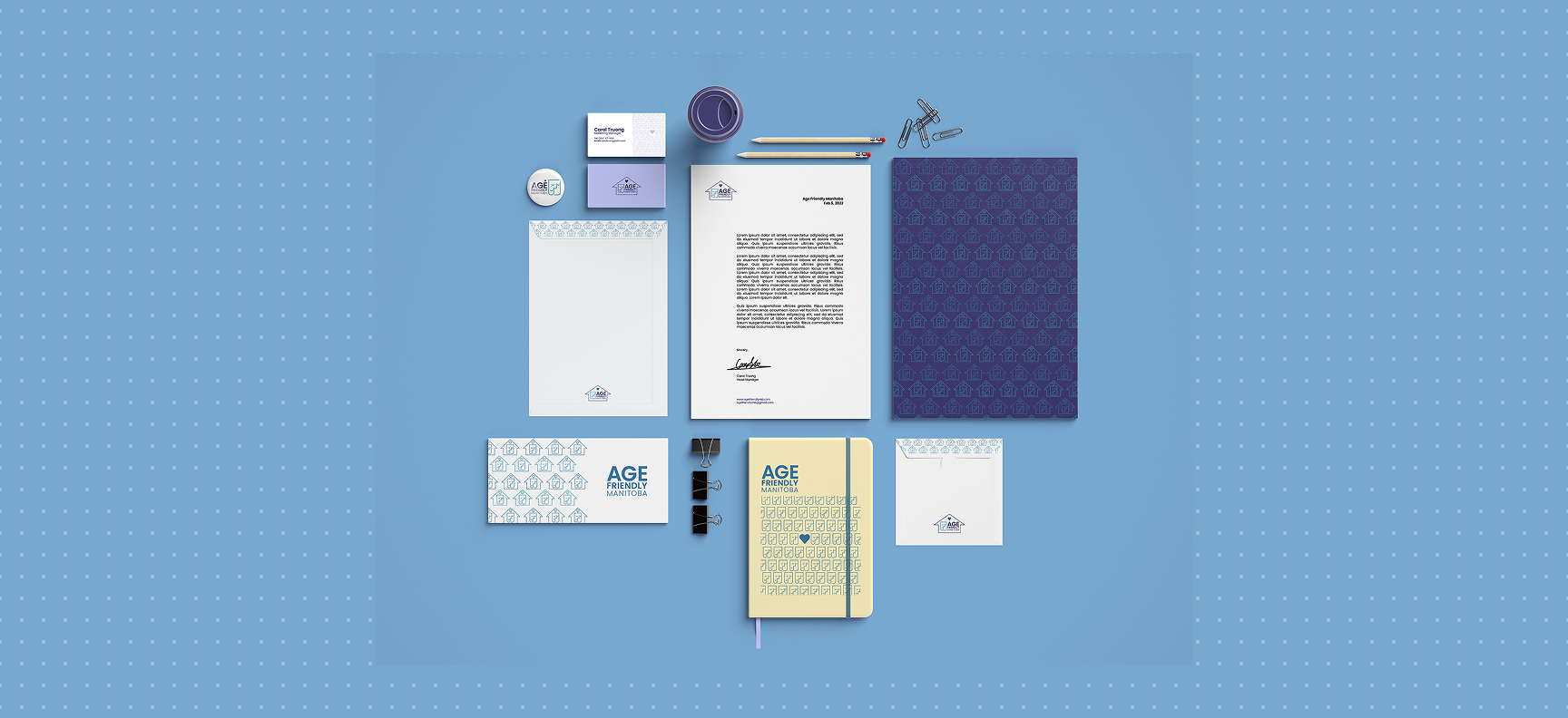
Another important consideration was flexibility. The logo was designed to work across a variety of applications, including solid-colour backgrounds, photography, and textured surfaces. This allows the identity to remain recognizable across different communication materials, from digital platforms to physical promotional materials.I also envisioned the logo being used as a sticker or other small-scale promotional element in public spaces. By placing the identity in everyday environments, the program could become more visible and encourage conversations about the importance of intergenerational connection and community support.
Concept Behind The Design
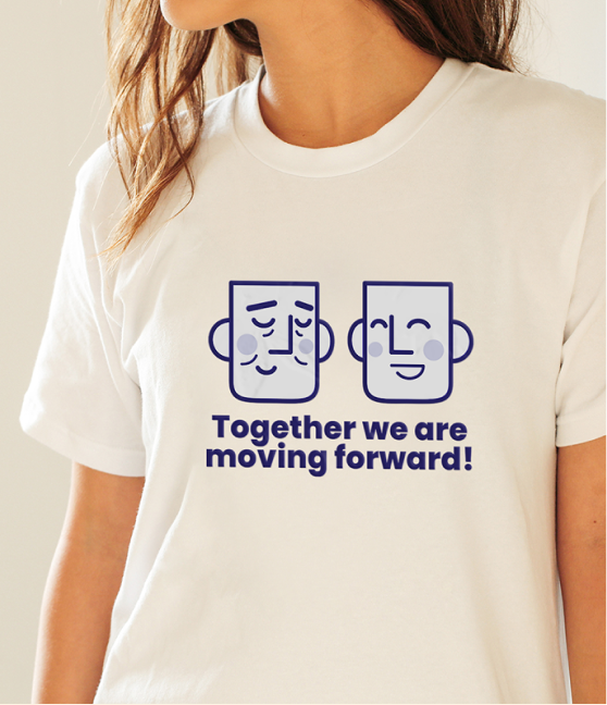
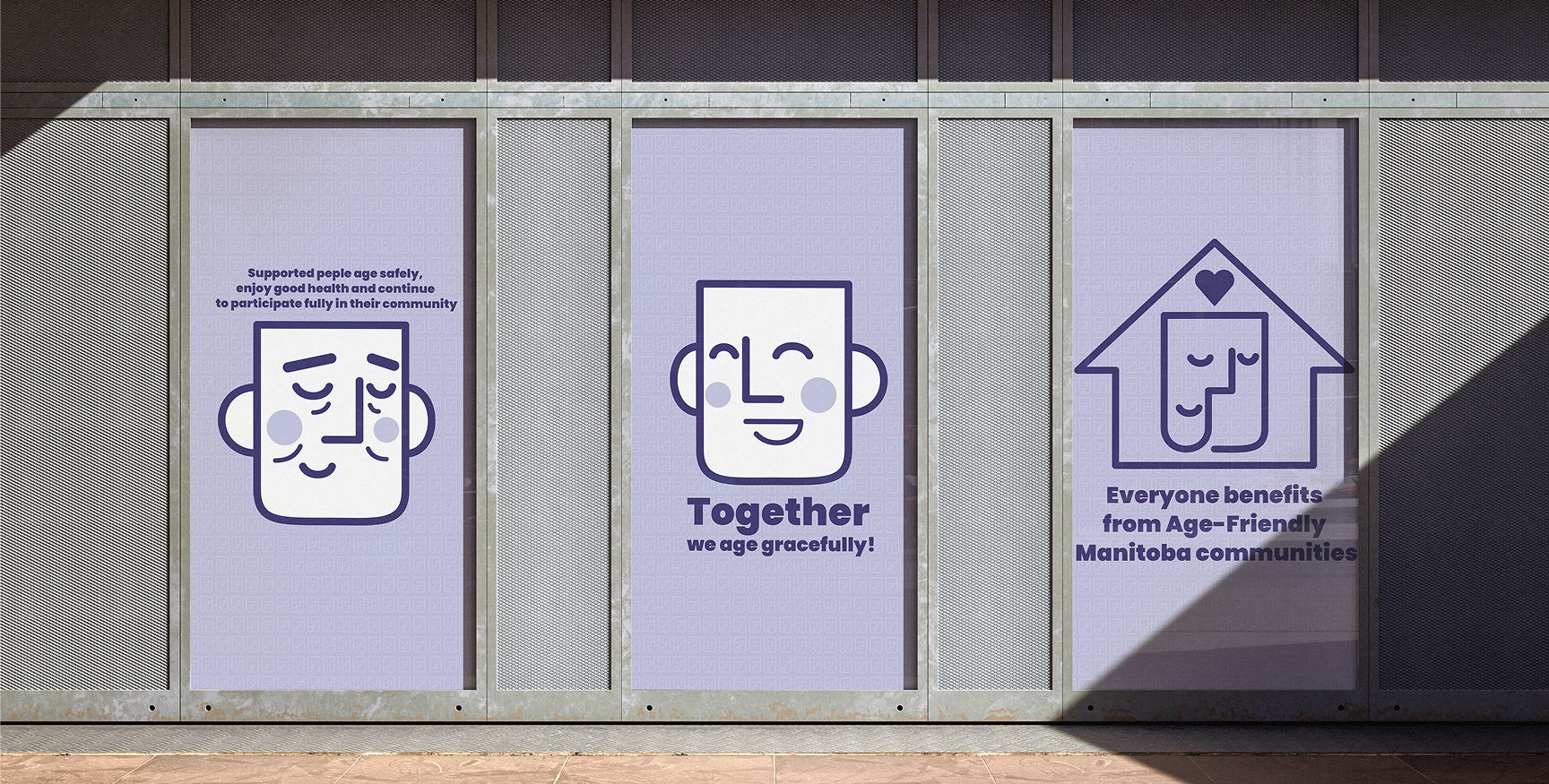
The logo is intentionally open to interpretation. Depending on how it is viewed, the facial expression can suggest both positivity and negativity, creating a visual metaphor for how we perceive the world around us. At first glance, the closed eyes may suggest a person who is calm, peaceful, or detached from their surroundings. However, the same closed eyes can represent a moment of reflection—taking the time to listen, observe, and understand the people around us with an open mind. This idea is represented through the unfinished line forming the head. The incomplete form suggests that there is always more to learn, understand, and contribute. Regardless of our age, background, or circumstances, we all can pause, listen, and consider how we can support one another.
Ultimately, the Age-Friendly Manitoba identity redesign is not simply about creating a new logo. It is about visually representing the idea that age-friendly communities are built through connection. By encouraging younger and older generations to understand, support, and learn from one another, the project aims to communicate that a stronger community begins with people looking out for each other.
© 2026 Tia Nguyen Creative Design. All rights reserved.