Amore Mio Rosato
Project Overview
The goal of this rebranding assignment was to redesign the packaging of an existing beverage brand and develop a new visual direction that could give the product a stronger, more distinctive presence. I chose Amore Mio Rosato as an opportunity to develop my design skills in packaging design while exploring how typography, colour, and composition can express the wine’s personality.
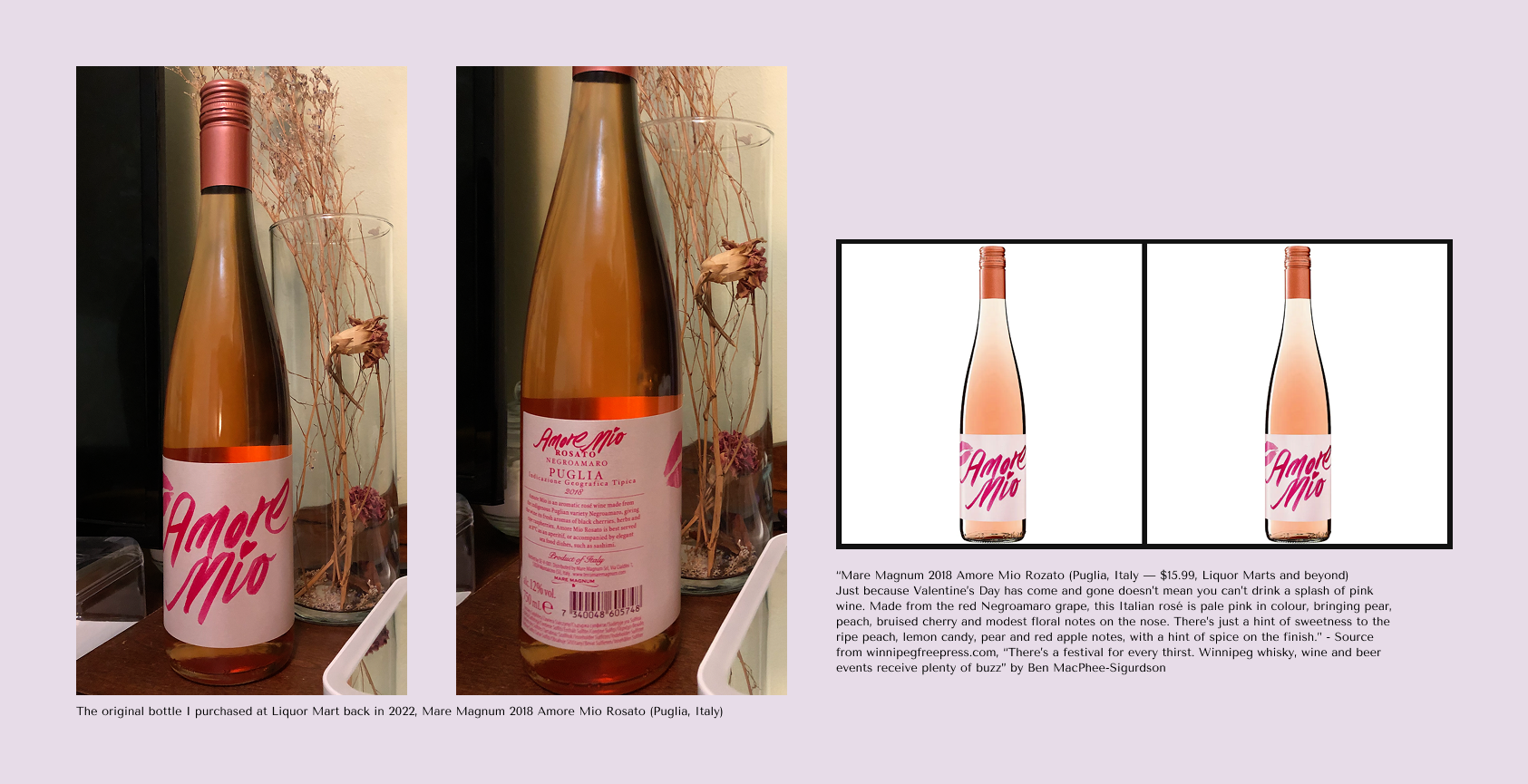
The original bottle I selected is the 2018 Amore Mio Rosato, a Puglia rosé made from the Negroamaro grape and produced by Mare Magnum. Contemporary records also identify this 2018 product as a 750 ml Italian rosé, while a Winnipeg Free Press review described the wine as pale pink with notes of pear, peach, bruised cherry, and subtle floral aromas.
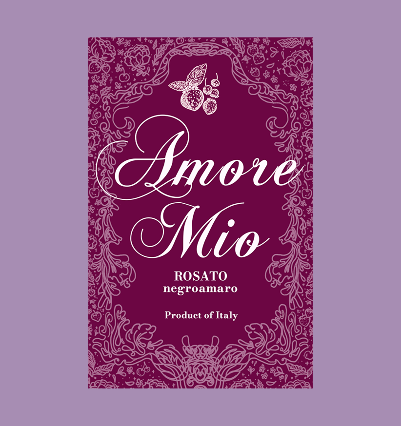
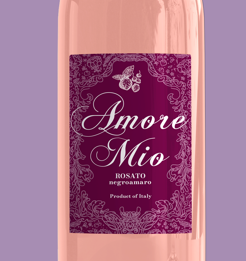
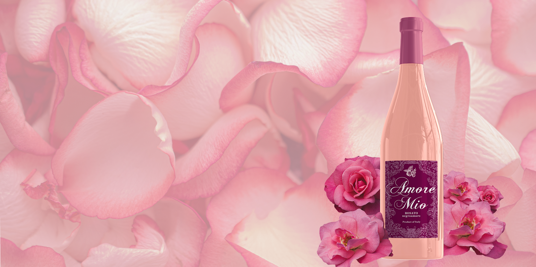
For my redesign, I wanted to create a label that felt more romantic, elegant, and timeless while still maintaining the recognizable identity of Amore Mio. The name itself, which translates to “my love,” became an important inspiration for the visual direction. Rather than simply modernizing the existing label, I wanted to reinterpret the brand through a more sophisticated visual language.
Background
The 2018 wine is associated with Puglia, Italy, and the Negroamaro grape. Contemporary records and product listings distinguish this Puglia/Negroamaro version from a later Amore Mio Organic Rosato released as a Frappato from Sicily. The characteristics of the wine also influenced my visual direction. The 2018 Amore Mio Rosato has been described with fruit and floral notes, including cherry and subtle floral aromas. These qualities gave me a foundation for developing a visual identity that combines romance with botanical and natural elements.
For Amore Mio Rosato, I wanted to explore how the characteristics associated with wine—fruit, flowers, vineyards, and nature—could be translated into a visual identity. Instead of using these elements simply as decoration, I wanted them to work together to create a visual story around the product. The name Amore Mio, meaning “my love,” also provided an important conceptual foundation for the design. The idea of love and affection influenced my choice of floral elements, particularly the red rose, while the organic illustrations helped connect the romantic qualities of the brand with the natural origins of wine.
Identifying the Problems
The main challenge was to create a wine label that could feel more distinctive and premium without losing the personality of the original brand. The original label uses a bright, handwritten typography for the name, and the image of a lipstick kiss mark. Therefore, the label gives it an energetic and approachable character. However, the overall packaging could be elevated through a stronger visual system and a more intentional relationship between typography, colour, and decorative elements.
I also wanted to avoid creating another generic minimalist wine label. Although minimalism can communicate sophistication, many contemporary wine brands use similar approaches, which can make it difficult for individual products to develop a memorable identity.
Concept Development
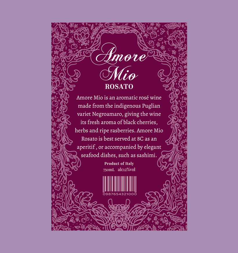
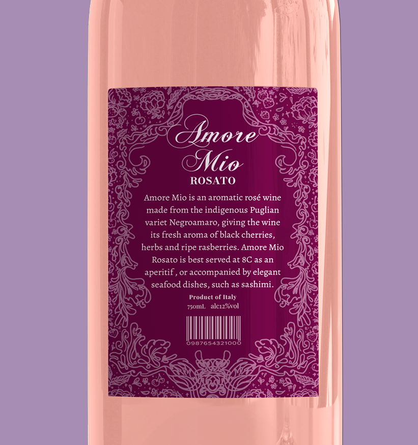
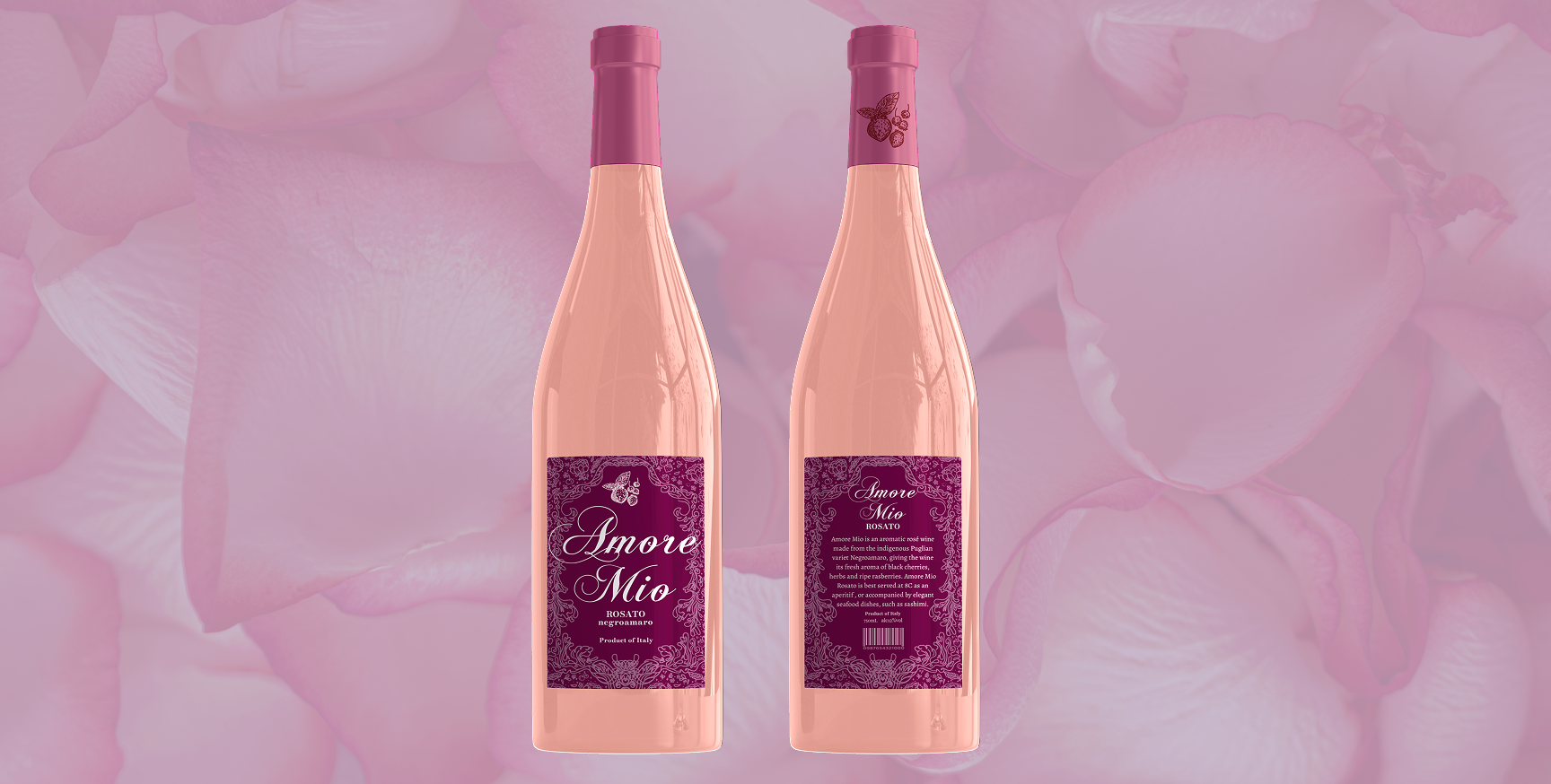
The concept behind the packaging is centred around the beauty and connection of nature. I wanted the label to feel as though the natural elements of a vineyard had been transformed into a visual story surrounding the bottle. The repeating fruit pattern represents the wine’s fruity character, while the grape leaves connect the design directly to the vineyard. The flowers introduce a softer and more romantic quality, reflecting the delicate nature of rosé wine.
At the bottom of the ornamental organic vine illustration is a bee, which became an important symbolic element within the design. Bees represent hard work, activity, and cooperation. They play an essential role in pollination, helping flowers grow and contributing to the natural ecosystem. Including the bee completes the relationship between the different elements of the illustration. The fruits, flowers, grape leaves, and bee all work together to represent the connection of nature.
Ultimately, the packaging is designed to communicate more than the product itself. It creates a visual story about nature, beauty, romance, and craftsmanship. By combining contemporary typography with organic illustration, the new Amore Mio label presents the wine as an elegant and refined product while maintaining a sense of warmth and natural beauty.
© 2026 Tia Nguyen Creative Design. All rights reserved.