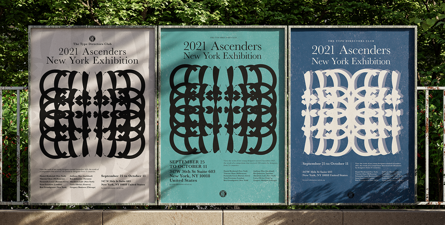
The Type Directors Club 2021
Project Overview
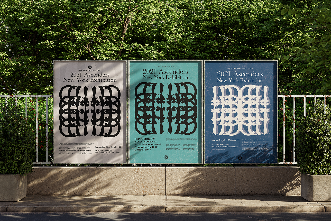
For this school assignment, the Individual Letter Project, I was assigned the letter C to create a poster for The Type Directors Club of New York. The purpose of this assignment is to use the assigned letter to create an interesting visual for The Type Directors Club's poster with the given content of 2021 Ascenders New York Exhibition.
The Type Directors Club's Background
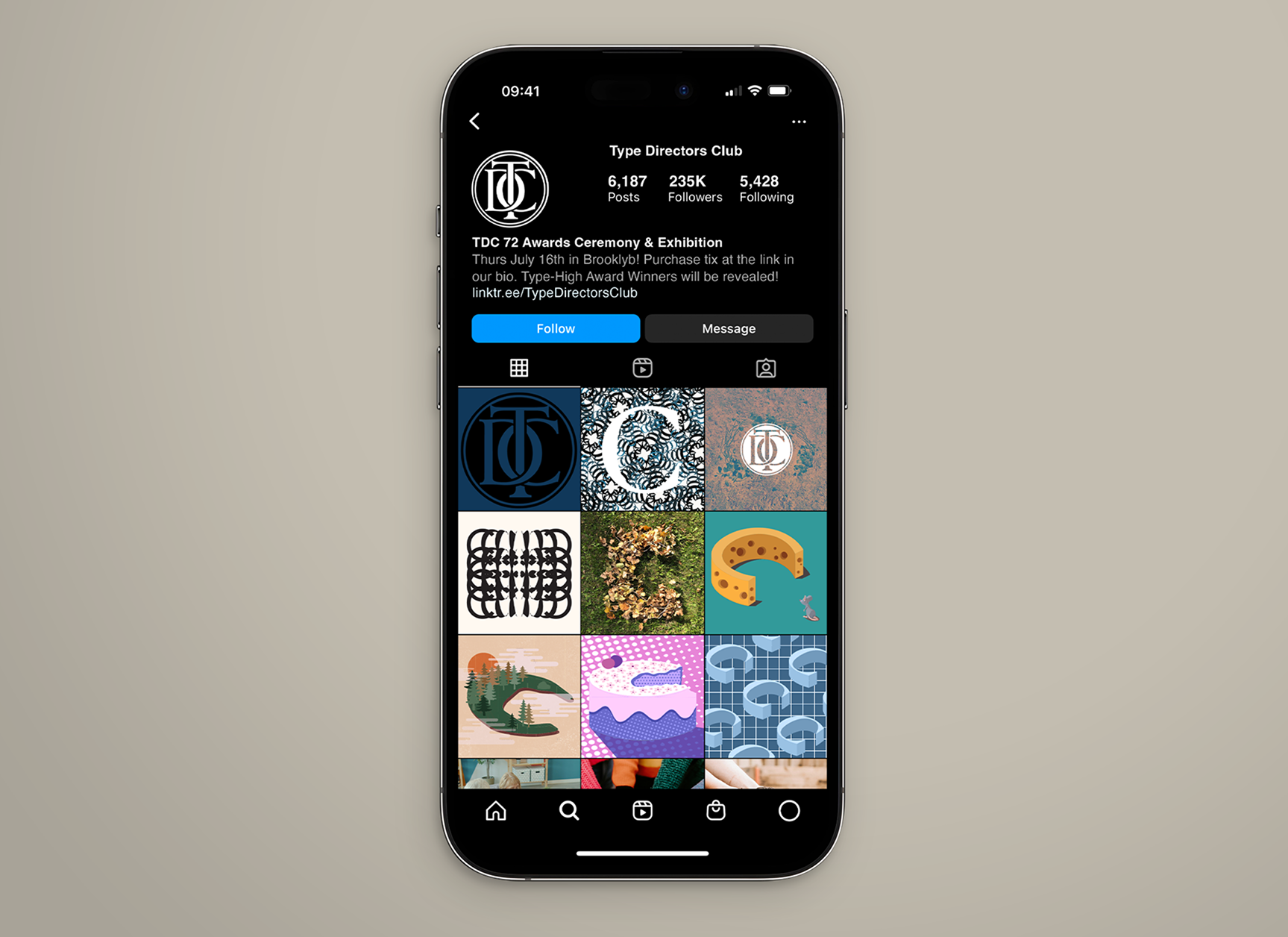
The Type Directors Club, or TDC, is a community of graphic designers, art directors, editors, media makers, students, entrepreneurs, and anyone who loves the letter world. The Type Directors Club was established in 1946 by luminaries and members such as Aaron Burns, Freeman Craw and Louis Dorfsman.
The Type Directors Club have a strong belief in how types and cultures have a huge impact. They are the people who love typography, letterforms and the written world, and they want to share this value between cultures. They represent the power of typography and also build a stronger, connected community with people who enjoy the typography world. Not only showcase typography’s power, but they also create opportunities for students with potential, support early-career professionals, and recognize the excellence of typefaces across the world.
Concept Development
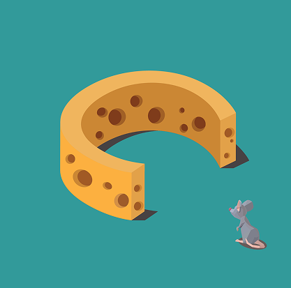
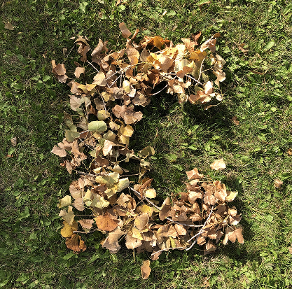
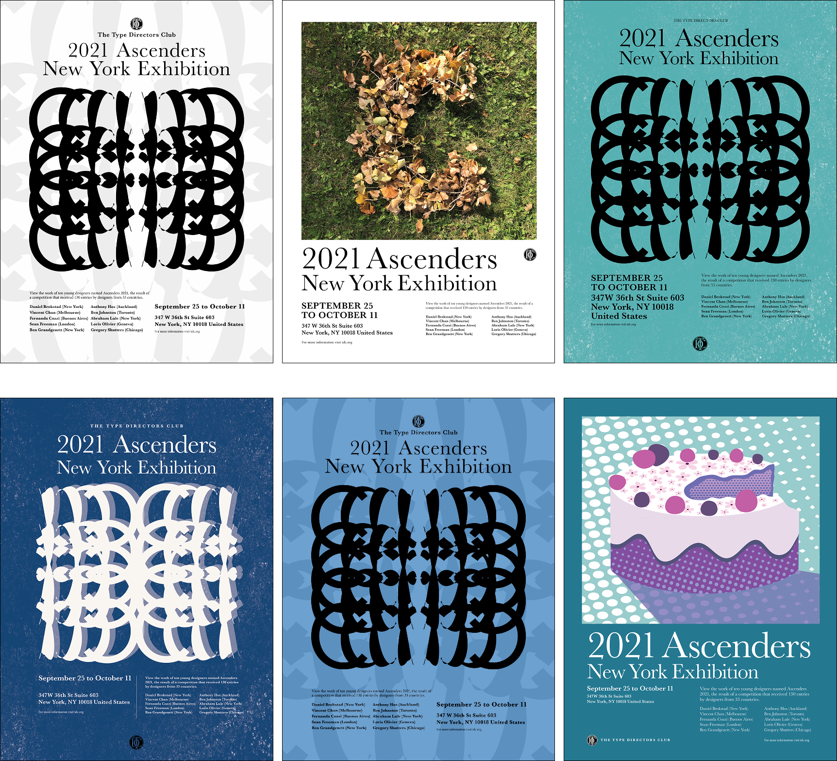
The letter C can be formed in any shape or colour, or created with any words. The letter C can even be created and shaped by the letter itself. When it comes to shapes, there are many things that can be converted into the letter C. For example, the moon, the slinky, a gymnast doing a bridge pose or pike pose, etc. Take the example of the banana’s shape. These are some of the letter C prototypes I created to analyze the letter C from different perspectives.
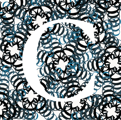
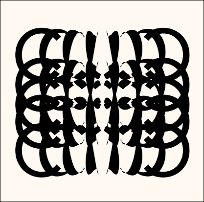
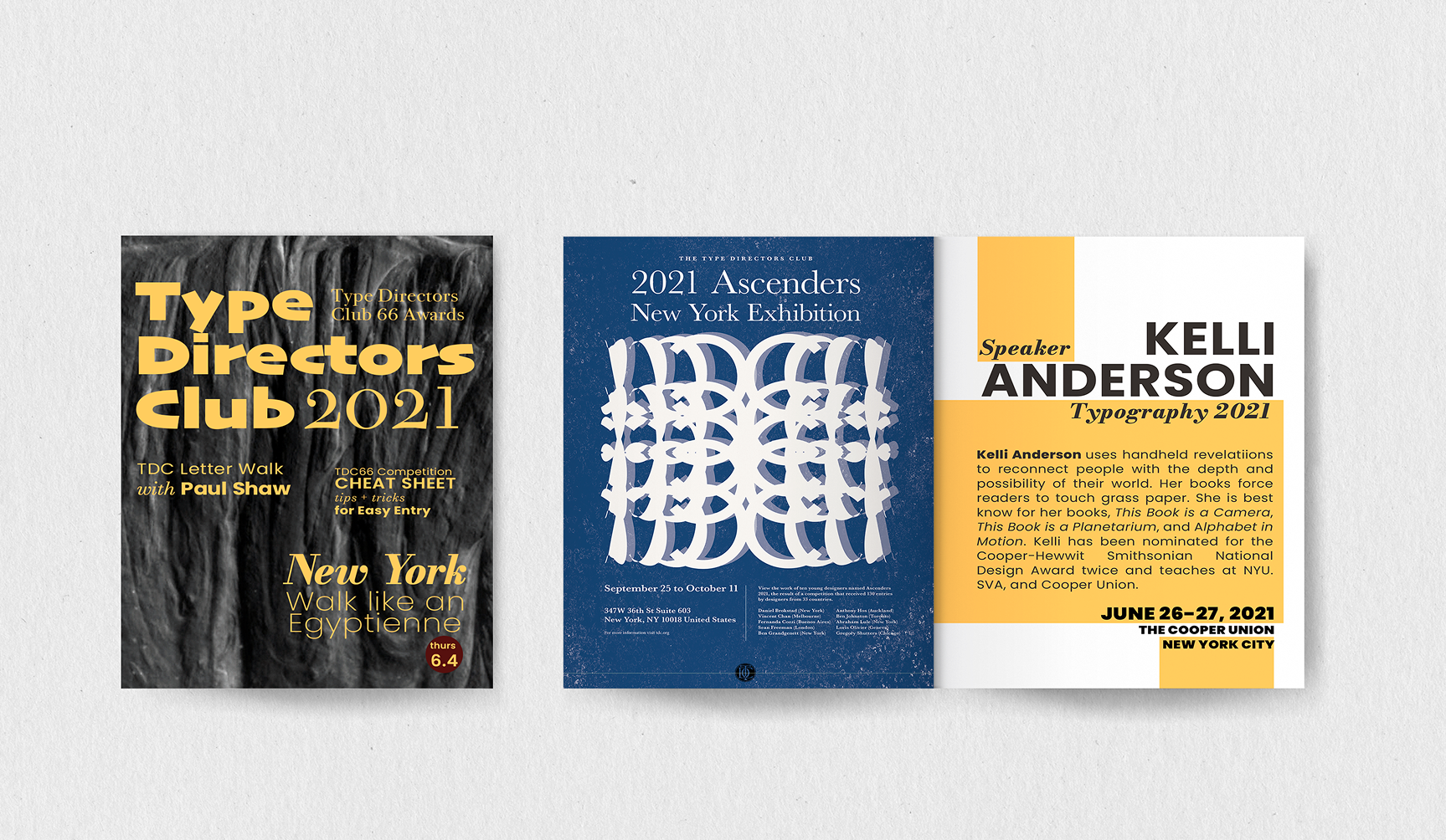
In this poster series, I used different C prototypes to determine which concept would be most relevant to the exhibition. To refine the final artwork for the poster by adjusting the colours and layout, I successfully created the letter C to represent the modest pattern for the final poster. The inspiration was from the gorgeous details of Gothic Architecture and the minimalist aesthetic of the Avenir font. Combining these two inspirations, a pattern was created from the repetitive letter C.
© 2026 Tia Nguyen Creative Design. All rights reserved.